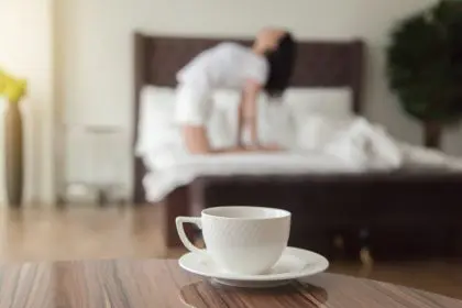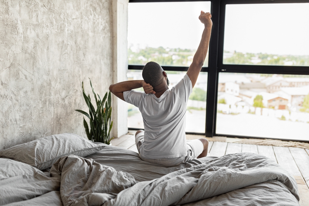
When it comes to getting restful sleep, many people focus on diet choices, exercise timing or screen usage before bed. What often gets overlooked is one quiet disruptor surrounding sleepers every night: the color of bedroom walls. Paint that looks stylish may actually interfere with the ability to unwind, relax and drift into deep sleep.
The psychology of color and rest
Color has psychological impacts that can alter mood, behavior and even heart rate. While bright, bold colors might energize living rooms or home offices effectively, they can disrupt sleep patterns when used in bedrooms.
When lying down at night, the body signals the brain to slow down and prepare for rest. However, certain colors send opposite messages, causing the nervous system to remain alert. This results in delayed sleep onset, fragmented rest or even insomnia.
Understanding how colors affect the mind can help create bedroom environments that support rather than hinder quality sleep.
Bright reds and oranges overstimulate the mind
Bold reds are associated with passion, energy and intensity. In bedrooms, however, these fiery tones can keep minds overstimulated, making it difficult to wind down. Research indicates that rooms painted in red can slightly elevate heart rate and blood pressure—responses that oppose sleep preparation.
Oranges follow similar patterns. Though often linked to creativity and cheerfulness, they can spark excessive mental activity before bedtime. Even burnt orange accent walls may be sufficient to keep minds active when they should be settling into restful rhythms.
These warm, intense colors trigger alertness responses that work against the natural sleep cycle, making them poor choices for spaces dedicated to rest.
Electric yellows disrupt calm
Yellow may represent sunshine and positivity, but its bedroom effects can be more jarring than joyful. Bright or electric yellows tend to stimulate mental activity and increase alertness. While this might benefit morning energy, it opposes nighttime relaxation needs.
Even soft or pastel yellows can be problematic. The subtler the shade, the better—but yellow hues are generally best reserved for kitchens, bathrooms or rooms with significant daytime activity.
The stimulating nature of yellow makes it incompatible with environments designed for rest and recovery.
Stark whites and grays create emotional distance
White rooms may feel fresh and modern, but when too stark, they can appear sterile and cold—resembling clinical environments. This lack of warmth makes it harder to feel cozy and secure, emotional states essential for quality sleep.
Cool grays, especially darker charcoal tones, can feel gloomy or emotionally flat. While some believe gray promotes calm, wrong shades can introduce feelings of sadness or detachment that do not support deep rest.
Colors that create emotional distance can interfere with the psychological comfort needed for restorative sleep.
Vibrant greens and blues can backfire when too intense
Generally, blues and greens receive praise for calming and soothing qualities. However, tone and saturation matter significantly. Neon green or bright teal may feel energizing during the day but can appear too stimulating or artificial at night.
Overly intense blues, such as cobalt or electric shades, may increase mental alertness similar to red and orange counterparts. Better alternatives include muted tones like:
- Soft sage green
- Dusty aqua
- Pale sky blue
- Muted seafoam
These gentler colors evoke nature and peace without overstimulating the brain.
Optimal colors for restful sleep
When repainting bedrooms with better sleep in mind, aim for muted, earthy or cool undertones. Effective choices include soft lavender, warm taupe, muted blues or gentle forest greens. These colors signal the brain to relax and mimic natural environments associated with evening and nightfall.
Off-white with hints of blush or cream also offers cozy feelings without the clinical effect of plain white. The goal is choosing colors that nurture feelings of safety, warmth and calm—inviting sleepers to close their eyes without resistance.
Recommended bedroom colors:
- Soft lavender or pale purple
- Warm beige or taupe
- Muted sage or forest green
- Dusty blue or gray-blue
- Cream or warm off-white
The impact of environment on sleep quality
Considering how many hours people spend in bedrooms, the role color plays becomes significant. Individuals struggling with sleep who cannot identify root causes might have wall colors quietly working against them.
Switching to more sleep-supportive shades could help improve nightly rest without requiring supplements or complex sleep routines. Unlike other health-related changes, repainting represents a one-time effort that provides ongoing benefits.
Environmental factors like color work continuously to either support or undermine sleep quality, making bedroom design choices more important than many realize.
Creating supportive sleep environments
Better sleep requires attention to environmental details, including visual cues. Bold design choices should not become silent disruptors of wellbeing. By choosing paint colors that help the body and mind relax, bedrooms can transform into the restorative sanctuaries they are meant to be.
Sleep quality depends not only on darkness and silence but also on visual environments that promote relaxation. When walls send stimulating rather than calming messages, sleep can suffer as a result.
The connection between color psychology and sleep demonstrates how environmental design choices can either support or hinder rest. Individuals experiencing sleep difficulties may benefit from evaluating their bedroom colors alongside other sleep hygiene factors.
Simple changes like selecting calming paint colors can create significant improvements in sleep quality, making this an accessible strategy for better rest that requires minimal ongoing effort once implemented.