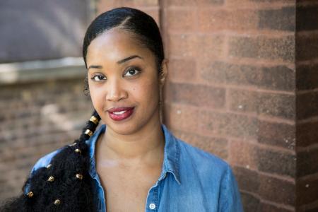
When photographer Tonika Johnson was in high school, she traveled from her South Side neighborhood of Englewood to the North Side in Chicago daily. In her travels, she noticed that streets on the North Side were strikingly different than streets with the same names on the South Side where she lived. Johnson’s new exhibit, “Folded Map”, is the culmination of her lifelong observations and illustrates the commonalities and disparities between two sides of the same city.
What did you learn from your investigation aboutt how neighbors from two areas felt about their communities?
It pretty much confirmed what I thought going into this project — that those on the North Side corresponding neighborhoods to Englewood, for the most part, were pretty satisfied [with] where they lived. They did express a few things that they would like to see in their neighborhoods, however, once they heard what South Side Englewood residents were missing from their neighborhoods it did not seem as serious.
What did residents want?
For example, one North Side, Rogers Park, pair wanted more restaurants with more American food options. When they heard the comparative Englewood residents just wanted restaurants, schools [and] a movie theater, they revisited their answers.
You developed “Folded Map” observing the differences between two identical street names. How long did it take you to develop the exhibit?
It has been a lifelong development. It did not hit me to pursue it as a photography project until last year. These were observations I grew up knowing, and I think people of color, especially Black people in Chicago, immediately can relate because we’ve been operating in that duality our entire lives. So, it was just taking this common knowledge that most African Americans in Chicago have — that we have to get out of our communities for so many things, whether it’s education, jobs [or] whatever other opportunities we have to access — by going to other neighborhoods that are, typically, predominately White.
Did you look at other possible variables, aside from segregation, to explain the city’s economic disparity?
The only variable I took into consideration to guide me through the project was North Side streets that were geographically equivalent to streets in Englewood with the same name. It was very important for me to find streets that were in the same range as the numbered streets in Englewood, say, 5700 South to 6900 South. Anything beyond that was getting close to Evanston, and some of the streets do not go that far north. Then trying to identify addresses that were as close to being as exact as possible on the same streets to compare them.
What were some observations you made while putting the project together?
The most glaring observation was that there were enough examples to know that the resulting segregation was not just an urban planning coincidence. All of the North Side addresses in “Folded Map” existed in neighborhoods that had thriving business corridors and nightlife. Everyone was satisfied the parks in their neighborhood were close by, grocery stores were accessible, [and] everything was generally convenient.
What are some possible solutions to this issue?
The solution is complicated. My intent of the project isn’t to solve segregation, yet reveal how systematic it really is. The primary reason is to help residents, individuals to feel like they contribute to a solution and to raise awareness because people, in general, don’t understand the issues facing Black neighborhoods in Chicago is systematic and that the city’s long-standing history of segregation plays a critical role in the structure of neighborhoods themselves. People don’t understand the history of disinvestment in Chicago’s Black communities created the conditions these neighborhoods struggle with solving today. So, part of the solution is people gaining awareness to help expand their thinking beyond a job program in neighborhoods like Englewood is the sole solution. To help people understand that people need to start visiting these neighborhoods, helping current residents buy homes in these neighborhoods. The point of the project is to put a mirror to all of us and say, “This is what segregation looks like, and we must start getting to know each other in order to help solve this.”
“Folded Map” opens July 3 at Loyola University’s Museum of Art, 830 N. Michigan Avenue.
